
The End of the World as We Know It
ISTD Award Pass
Sarah Boris Creativity Award
Typography . Narrative . Experimental
The End of the World as We Know was my response to the ISTD Milestones brief. For this project I explored the Y2K bug and media-induced-panic. The piece is fully typographic and throughout I stay loyal to the design conventions and trends of the 90’s. My research heavily informed the outcome, and after many rounds of iteration and experimentation the piece became a 2.5m long fax.
I used typography, scale, legibility, meticulous typesetting and narrative to create a glimpse into the panic caused by a fear-mongering news network and show a descent into chaos.
See my full fax video here!
Business Cards
Branding . Print Design . Interactive
See the video here!
Branding . Print Design . Interactive
The aim of my business card was to make the handing-over interaction fun and unique. The interaction is designed so I hand the card over with both hands. As the recipient takes the card and I let go, the thumb print marks are revealed. This creates a surprise and reveal. Symbolically, it represents that I’m incredibly hands on with all my work.
See the video here!
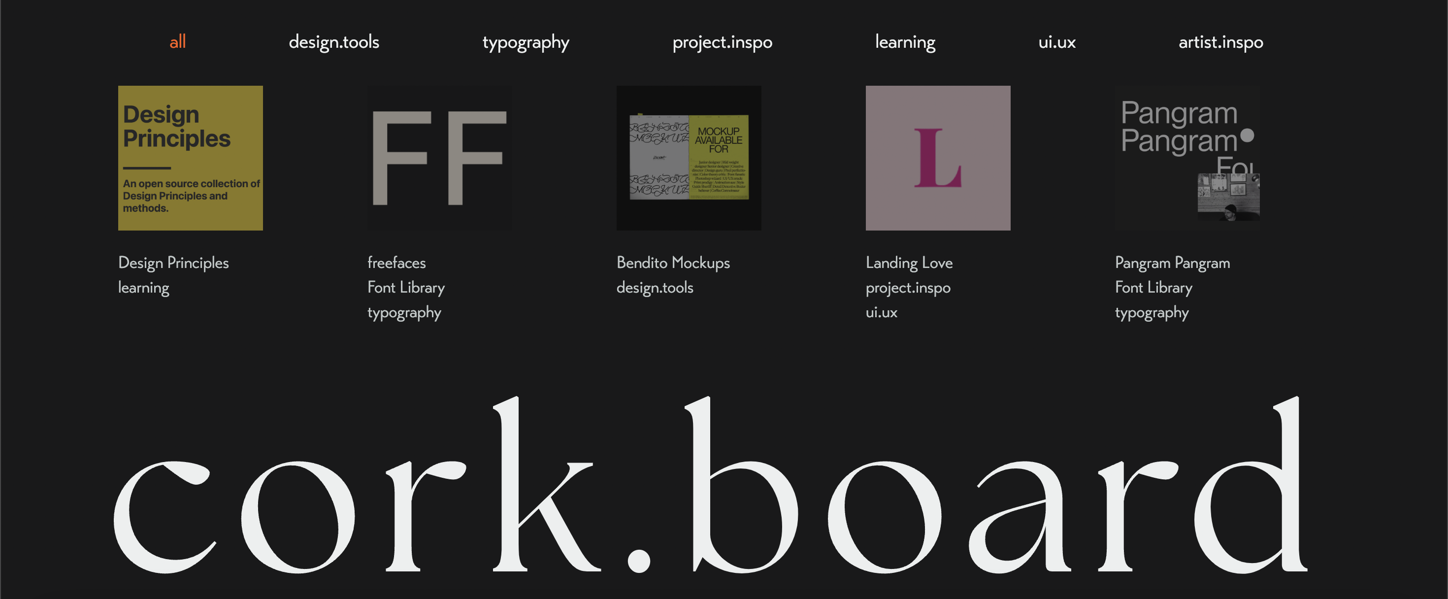
cork.board
Web Design . Coding HTML/CSS . Passion Project
www.corkboard.tools
Web Design . Coding HTML/CSS . Passion Project
My Website cork.board is my ongoing passion project. It was created to solve a problem. I was becoming frustrated by losing my useful design websites. Leading to me either spending a lot of time hunting them down or slowing my laptop down by having many tabs open. My solution to this is cork.board. I coded the website in 2 days and have been updating over the 7 months since. I’ve used it to develop my coding and web design skills, becoming more comfortable with the process of creating, deploying and updating a website.
www.corkboard.tools
Creepshow
Type Design . Typography . Poster Design
Type Design . Typography . Poster Design
Creepshow was my first project of university. It’s a modular typeface, inspired by tile patterns. I developed it with a whimsical yet hazardous gothic theme. A fun feature of it is the negative space between each character creates a cruciform.
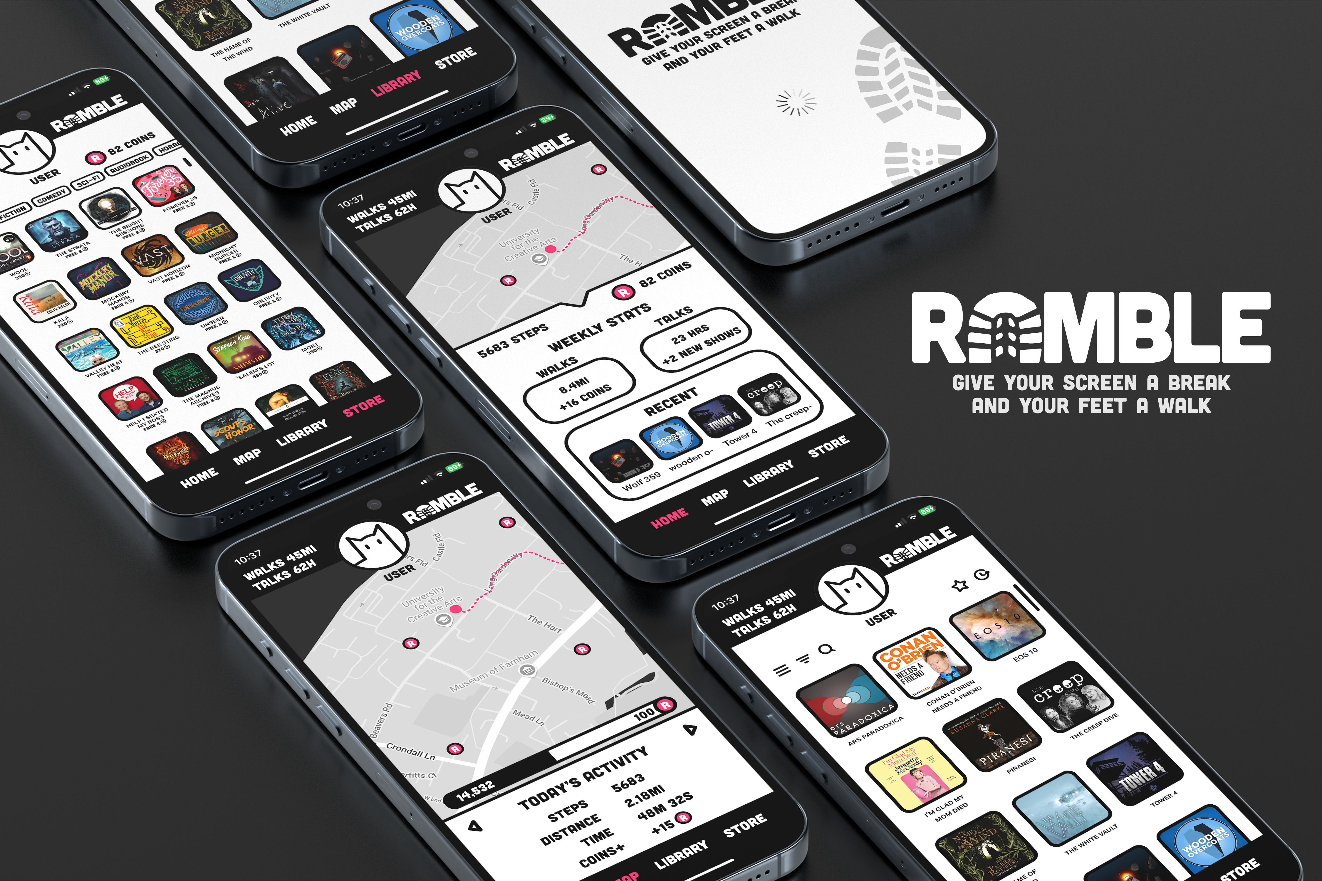
Ramble
Web Design . UI/UX . Branding
Web Design . UI/UX . Branding
Ramble was a short and fast paced project. I developed an app inspired by Spotify, Pokémon Go and Strava. It’s a service that encourages users to get outside and walk by promoting audio media. Walking is rewarded in coins, these can be spent in the in-app shop where users can buy audio books or unlock early podcast/audio drama episodes. This was an exercise in UI/UX, considering how a user will interact with my app and creating an engaging interface to experience.
cork.board
Branding . Speculative Design . Print Design
See my Airail advert here!
Branding . Speculative Design . Print Design
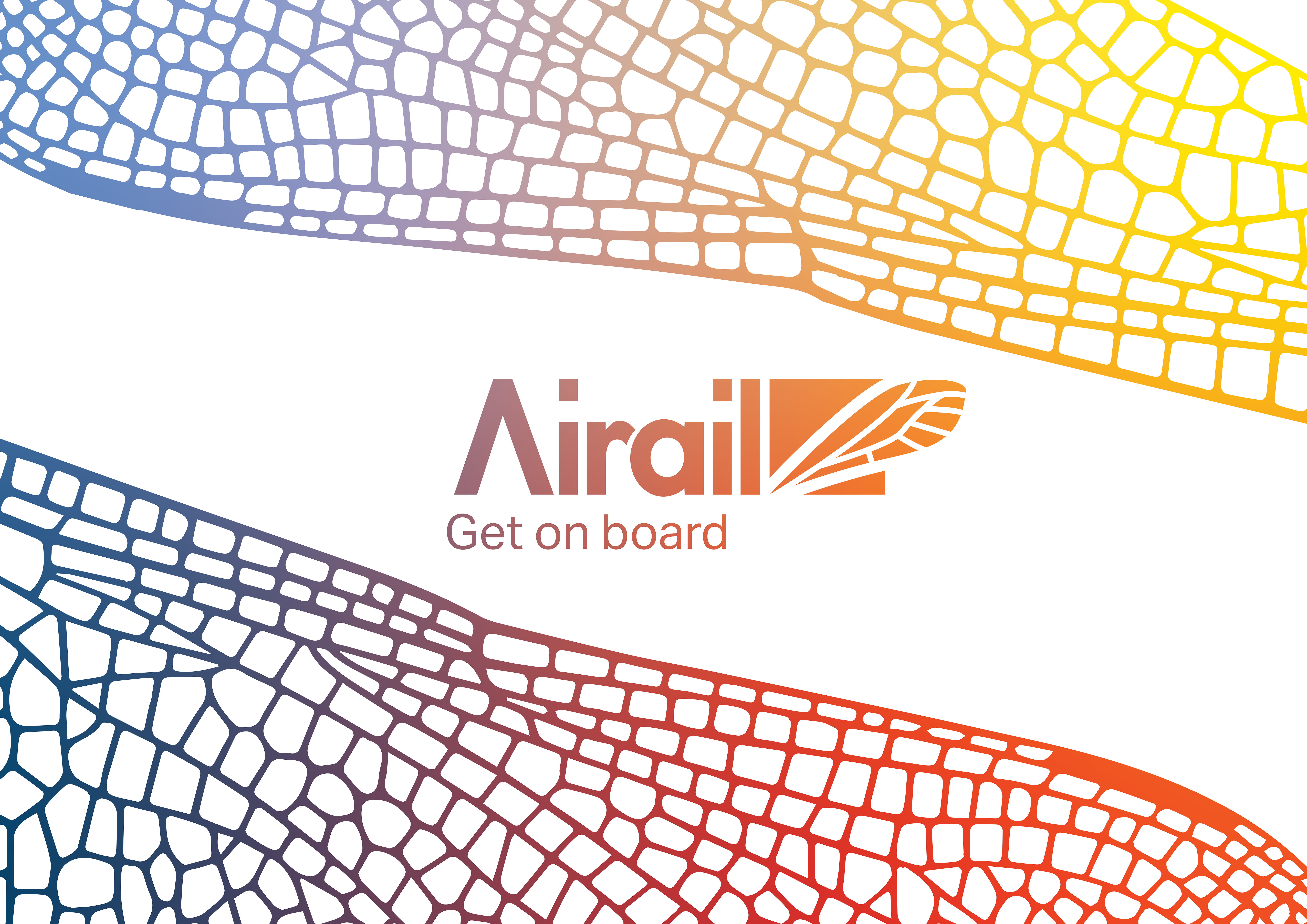
Airail is a speculative project, creating a solution for a real problem. The problem being the lack of affordable or reliable transport in the southwest. I developed the concept of Airail as a free maglev monorail with a focus on sustainability and targeting young adults. I developed a logo, created brand guidelines, printed a map and edited an advert. The brand values and demographic feed into the branding at every point in the process. This project developed my confidence in branding and creating a cohesive brand identity.
See my Airail advert here!
Yes in my Backyard
Editorial . Research Document . Print Design
Yes in my Backyard (YIMBY) was my first year final major project. During this I explored the causes of the NIMBY movement, and questioned if green design were beautiful, would we want more of it?
Editorial . Research Document . Print Design